Capturing the World of September Babies
Introduction
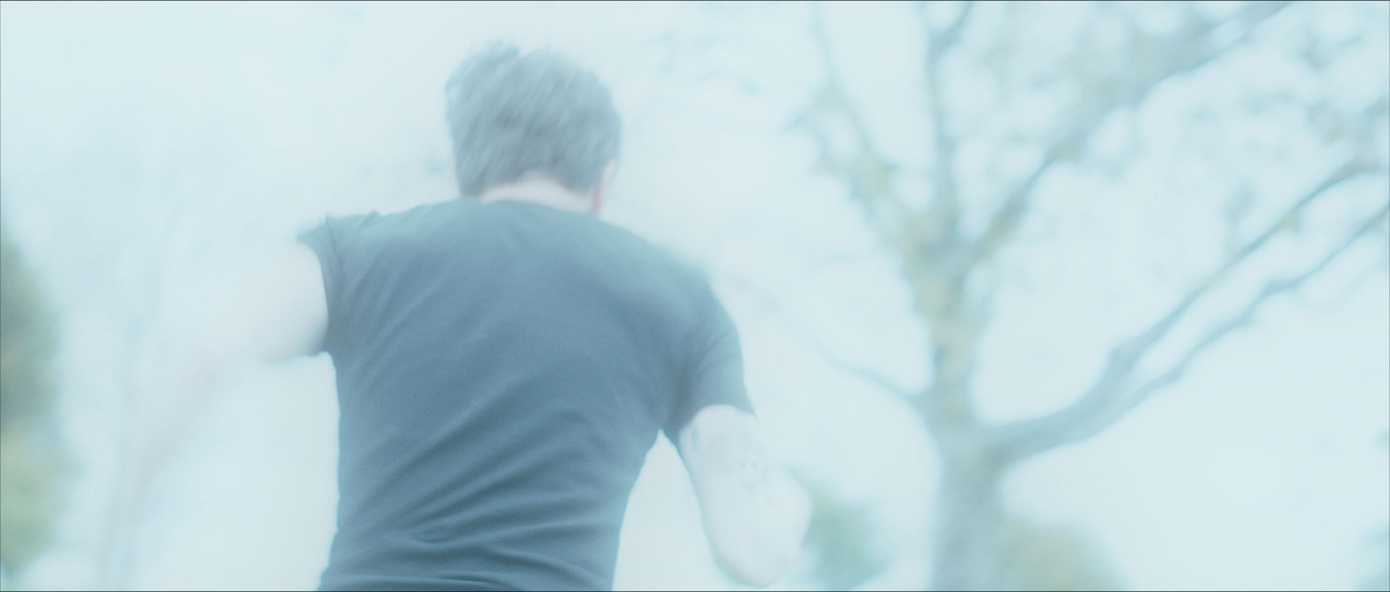
Our film "September Babies" features a captivating palette of vivid colors in its lighting, reminiscent of the dystopian future depicted in "Blade Runner 2049" and recent action blockbusters like the "John Wick” franchise. In the dark realm of "September Babies," “Zea” is born into a world where every decision carries extreme consequences, imbuing each small moment with a larger-than-life significance. This heightened reality is strongly reflected in the hyperreal visual aesthetics. While this daring approach to color may not suit every story, the invaluable lessons learned can expand your perspective on color and cinematography in your own project.
Why we choose bold colors in lighting:
- elevating the impact through a sense of heightened reality
- dressing the set with light to achieve a cohesive look
- censoring blood by matching its color and with that essentially turning the scene black and white
- improving situational awareness of the audience in intercut and flashback scenes

Establishing the mood
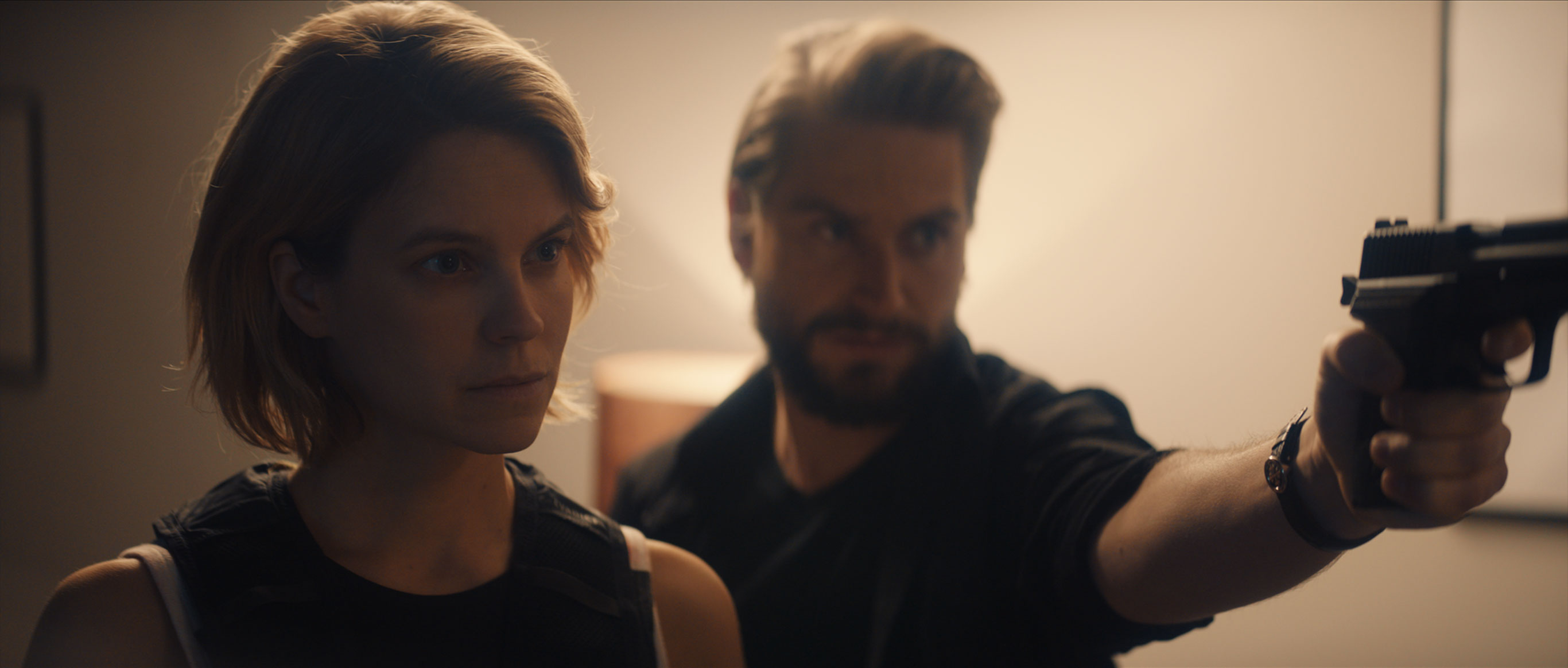
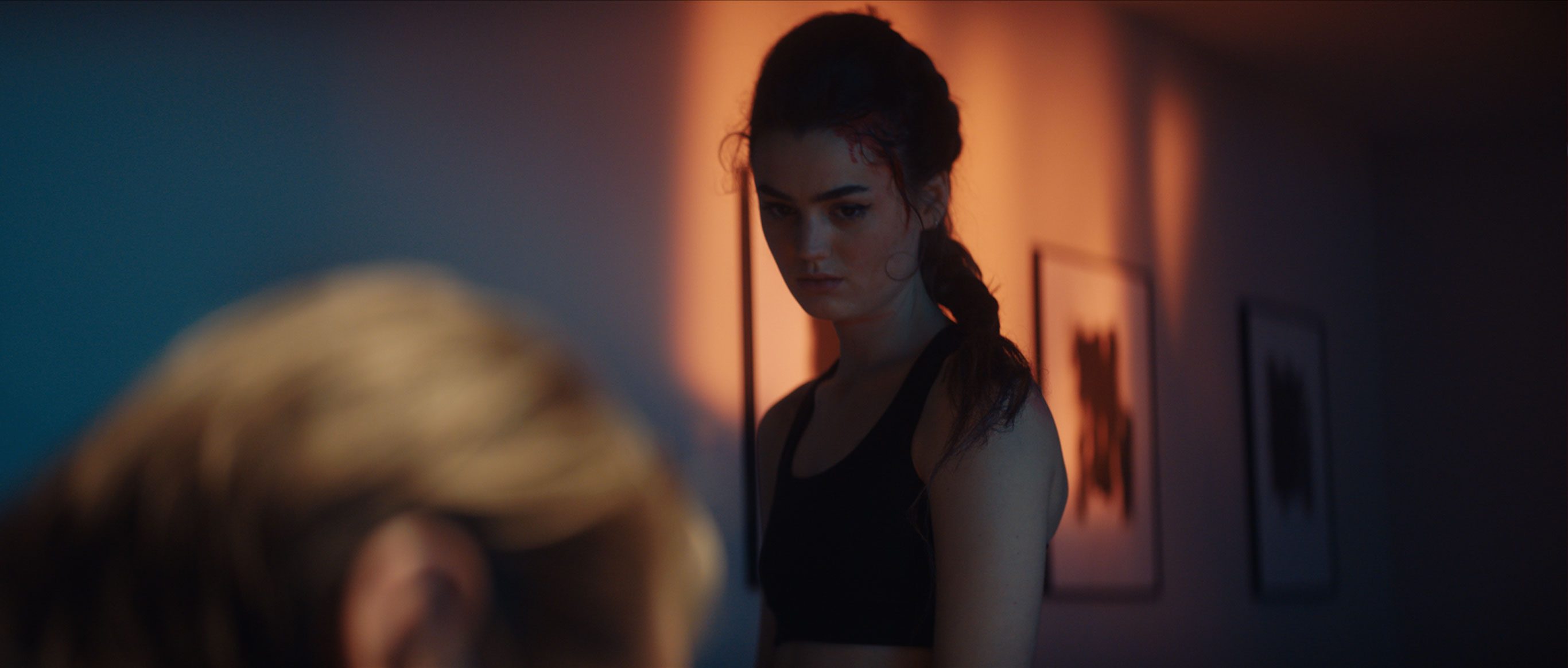
The use of lighting to craft the look and feel is a powerful tool for structuring your film's storyline and to swiftly establish the mood for each scene. During the early stages of developing "September Babies,” we recognised the necessity of intercutting the main storyline with flashbacks and concurrent moments to generate the required energy. Creating unique atmospheres not only serves to distinguish scenes and guide the audience but also shapes their perspective and empathy in alignment with the director's vision. As you witness the interpersonal tensions among our main protagonists evolve, you'll consistently return to a warmly lit apartment location, establishing a connection between “Nym” and “Zea”. Meanwhile, no other looks or colors are repeated across multiple scenes or settings, enabling you to instinctively recall previous events and recapture the emotions from the initial moments when we visited the scene for the first time. For example, when we revisit the red room scene and witness the devastation left behind by “Bonnie and Bono” for “Zea” to discover, we are immediately oriented in the storyline's timeline, drawing us back into the danger that looms within this space. By maintaining the specific red hue as “Zea” enters the back room, we effectively signal to the audience that these scenes unfold sequentially.
Show LUTs and Grading
Working with this look and preplanned lighting choices enabled us to work almost in an analog way, as if we worked with a custom film stock developed just for us. This not only offered perfect precision in guiding the colours through the whole pipeline but also greatly improved consistency and efficiency in the color grading process. Consequently, we could dedicate more of the extremely talented James Slattery’s time to fine-tuning intricate details without first having to find our broader look. This approach effectively shifted a substantial portion of decision-making and work to the pre-production phase, ultimately resulting in cost savings. As a cinematographer, it empowered me to meticulously craft a unique and original world for the story. Within this initial framework, we could refer back to the predefined rules and concepts, safeguarding against the pitfalls of unoriginality by steering clear of existing references.
Censoring Blood
However, providing clarity and subconscious orientation to the audience in a nonlinear storytelling structure is not the only reason for embracing bold, vibrant colors in your lighting choices. It also grants you control over every color that appears within your set. If your entire scene is bathed in red, blood will merely register as another shade of red, effectively rendering the scene black-and-white while retaining the visceral impact associated with the primal instinct that red signifies for all of us: danger. This not only diminishes the explicit gore of the scene, similar to a black-and-white depiction, but also intensifies the shared anticipation of danger that both “Zea” and the audience experience.
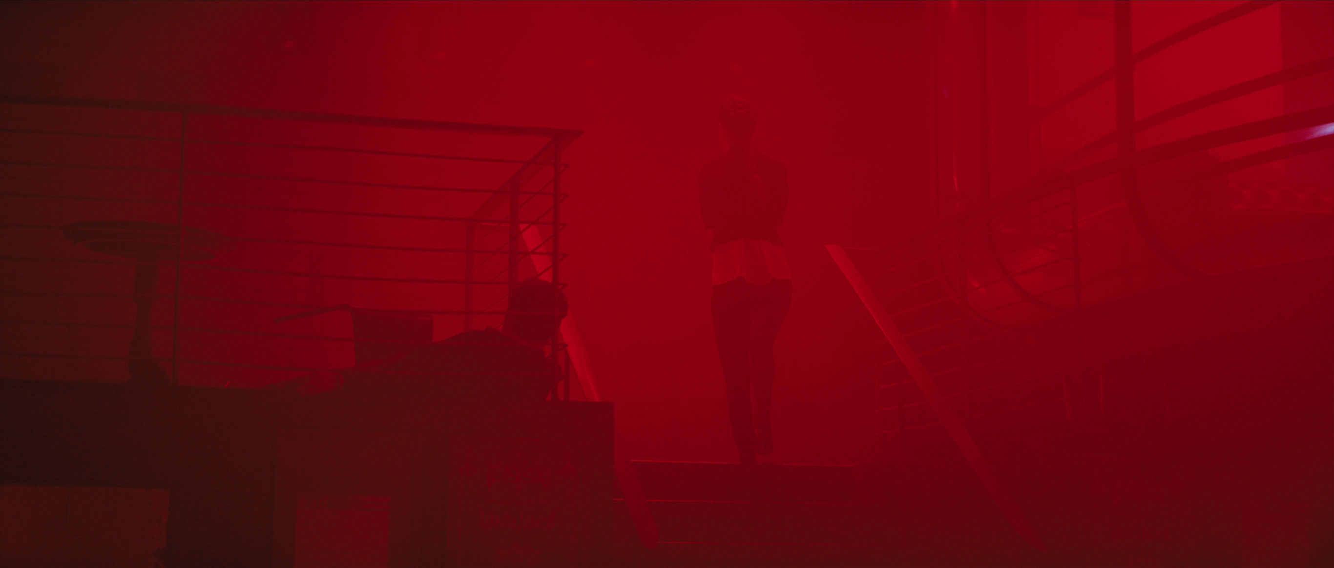
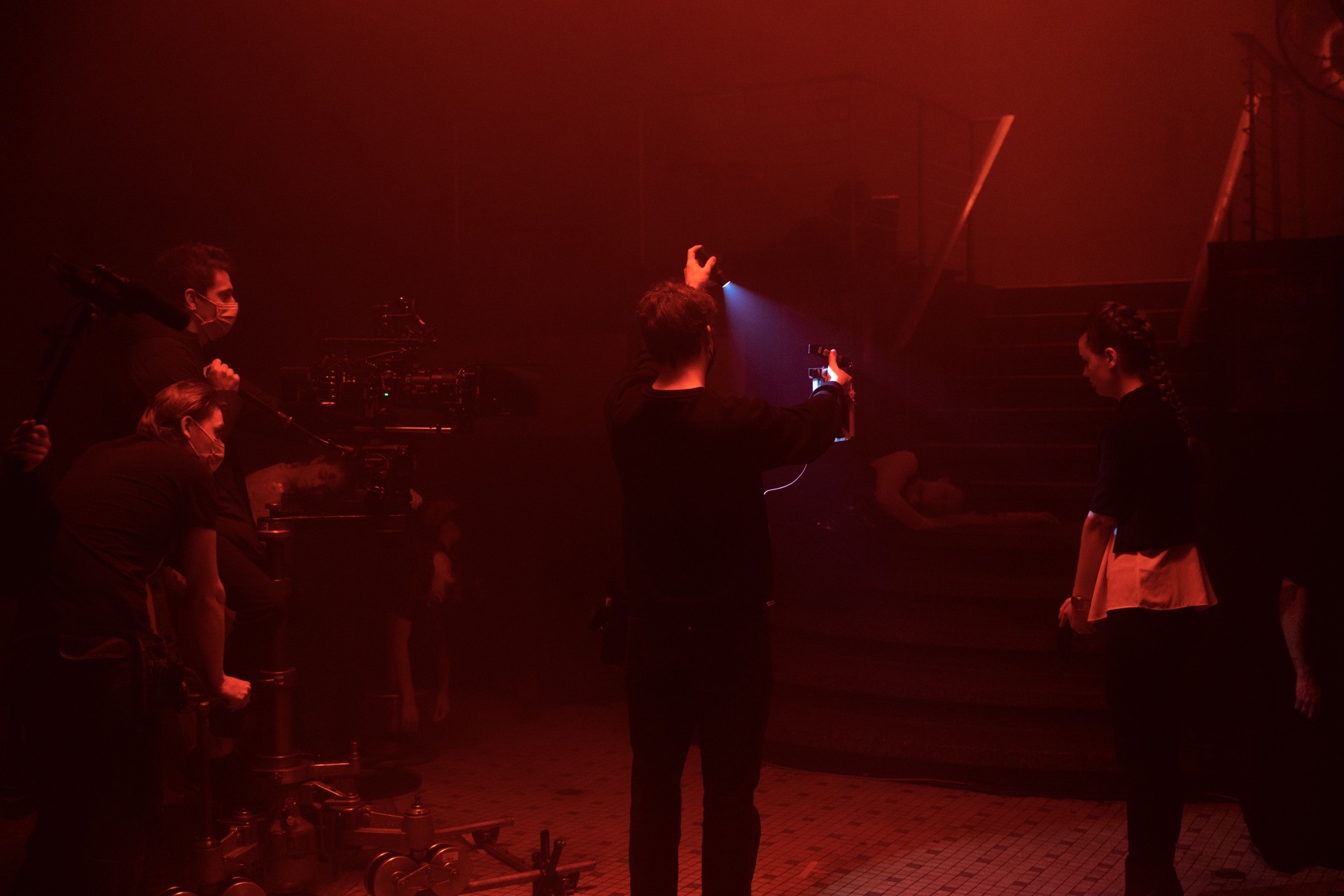
Physical red lighting
The color was not just pushed in post but lit this way on set to achieve more natural shades of red.
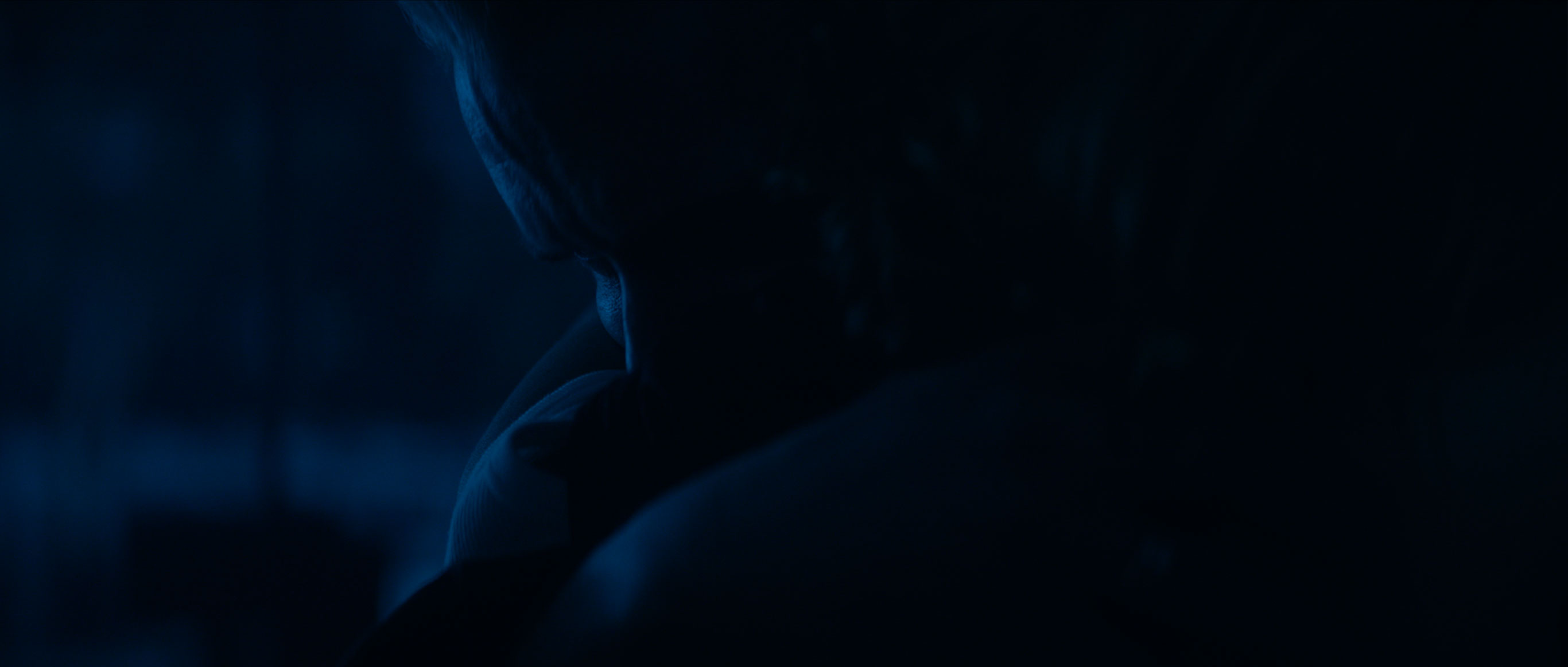
Close to black
With only a small part of the sensitivity of the camera lying in the blue a lot of light was needed.
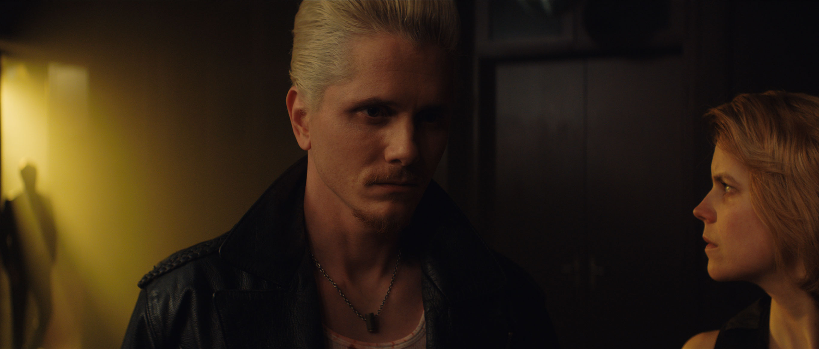
In another scene, opting for a strong blue hue spared the art department from the time intensive task of redecorating an entire library to match our color scheme. Simultaneously, the blue hue amplifies the somber and despondent undercurrents influencing the characters' decisions. One might assume that these decisions and color choices were made during post-production. However, we meticulously planned everything, including how to achieve specific shades using colored gels on tungsten fixtures. Our exhaustive testing not only involved assessing how different hues would translate on the ALEXA sensor but also to explore how they mixed and how they would play with simple and efficient grading adjustments.
Safeguarding from AI
What's truly remarkable about this approach is that it can fortify you against artificial intelligence taking over your job. If you ever wondered about what cinematographers would be replaced first by AI and if this could be you, you might also have pondered your reliance on still references such as "Shot Deck" and other established databases, which could serve as ideal training material for image-generating algorithms. Have the courage to harness your human intuition and creativity, leveraging your knowledge and practical experience to visualize a world that no neural network could replicate using color and exploring new concepts.
Other Articles